Image Components
| S.No. | Component Name | Description | I&F Variations | Classic Variations | live Reference url | Component image |
| 1. | Image Gallery | Image Gallery component to display a collection of related images on a page. This component can display images as a simple slideshow and is especially useful in image gallery display mode to show large groups of images. Keywords : Header,Description, |
I&F Template Variation | non I&F Variation | reference live url |  |
| 2. | Image | Used to add images in a page with different sizes and alignments. Keywords : Image Alt Image |
I&F Template Variation | non I&F Variation | reference live url |  |
Video Components
v
| S.No. | Component Name | Description | I&F Variations | Classic Variations | live Reference url | Component image |
| 1. | Video Carousel | The Video Carousel component allows to a display a selection of rotating images with a title, brief description and link to an associated story. Keywords: Brightcove video ID, Title, Description, Video duration ,Video thumbnail,MP4 file, YouTube URL |
I&F Template Variation | non I&F Variation | reference live url |  |
| 2. | Video List | The Video List component allows to add the video or list of videos in a page. Keywords: Title, Description, Brightcove video ID |
I&F Template Variation | non I&F Variation | reference live url |  |
| 3. | Video and Image Carousel | The Video and image component allows to add the video or list of videos in a page. Keywords: Image, Image Alt text, Carousel, Media type, Profile Image, Title, Description, Border color on the top, Border, Include CTA |
I&F Template Variation | non I&F Variation | reference live url |  |
| 4. | Video Watch and Share Component | The Video watch and share component allows to add the video with watch and share cta buttons options. Keywords: Title, Description, Brightcove video ID |
I&F Template Variation | non I&F Variation | reference live url |  |
Text Components
| S.No. | Component Name | Description | I&F Variations | Classic Variations | live Reference url | Component image |
| 1. | Accordian | The accordion component has two main states: collapsed and expanded.The "+" icon at the starting of the accordion indicates which state the accordion collapsed. The "-" icon indicates expanded. Accordions begin by default in the collapsed state with all content panels closed. |
I&F Template Variation | non I&F Variation | reference live url | 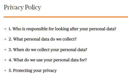 |
| 2. | Intro Text | This Component will us to add plain text with different sizes starting from font size small(16px),medium(20px),large(24px), and extra large(28px).It also has two types of font variations : normal text and I&F text with first letter colouring option. |
Intro Text - I&F Variation | Intro Text - Classic Variation | reference live url |  |
| 3. | Bulleted / Dashed List component | Bulleted Dashed List Component can be used to add Title with a borderline color, sub title and some description with hyperlinks(if required). We have an option to seperate the text using "Two Column Layout" checkbox. Keywords : Heading, Horizontal separator color, Sub Heading, Description, Left column content, Right column content |
I&F Template - Bulleted List | Bulleted / Dashed List - Classic Variation | reference live url |  |
| 4. | Card Component | Card Component is used to author a simple hyerlink with Title, Descritpion and Top Border Color. Keywords : Title, Link, Link target, Border line color on top of the card, Description |
I&F Template - Card Component | Card Component - Classic Variation | reference live url |  |
| 5. | Contact Us Component | Contact Us component is used to author the contact details with a message. Keywords: Image alignment, background color, font color, title, description, contact number |
I&F Template - Contact Us Component | Contact Us Component - Classic Variation | reference live url | 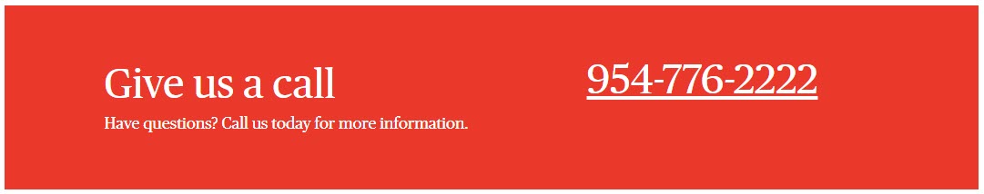 |
| 6. | Disclaimer Text Component | Disclaimer Text component is used to provide the plain text with different font color and opacity. Keywords: Description, font color, opacity |
I&F Template - Disclaimer Text Component | Disclaimer Text Component - Classic Variation | reference live url |  |
| 7. | List Component | List Component is used to author list of text items with some background color, title, description and hyperlinks for the list items. Keywords: Heading, Horizontal Seperator & List background color, Description, Include CTA checkbox, Include List Item Checkbox |
I&F Template - List Component | List Component - Classic Variation | reference live url |  |
| 8. | Login Component | Login Component is used to author different set of login options for Business Customer and Agent/Broker. Keywords: Header, background color, dropdown label, Option -> Option title, link, link target and include sublinks checkbox |
I&F Template - Login Component | Login Component - Classic Variation | reference live url |  |
| 9. | Promo Stack Component | Promo Stack Component is used to author stacked/two column links with title and left border color. Keywords: Layout type, Title, Link, link target, Left borderline color |
I&F Template - Promo Stack Component | Promo Stack Component - Classic Variation | reference live url |  |
| 10. | Proof Points Component | Proof points component is used to author the text in three column layout with background color, pre text, description and header. Keywords: Background color, font color, Include Highlighter checkbox, Header, Description, pretext |
I&F Template - Proof points Component | Proof points Component - Classic Variation | reference live url |  |
| 11. | Quote Section Component | Quote Section component is used to author the Quotes with related author name. Keywords: Quote, Author, Border Color |
I&F Template - Quote Section Component | Quote Section Component - Classic Variation | reference live url | 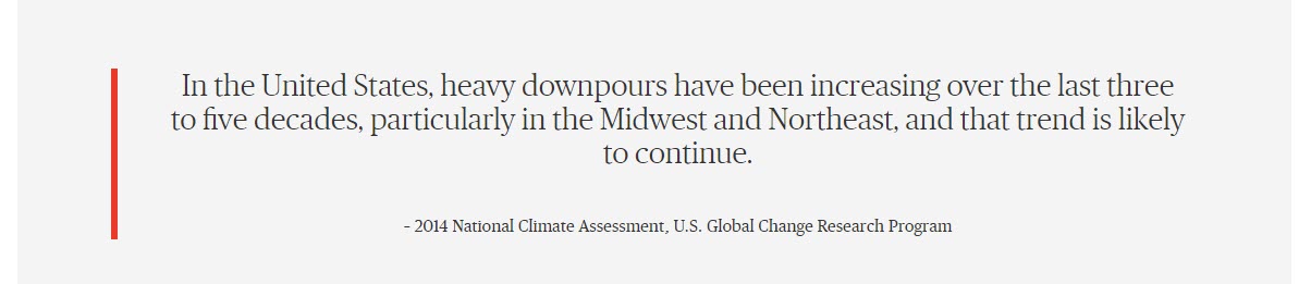 |
| 12. | Ribbon Component | Ribbon Component is used to author the ribbons which appear just below the hero component in most of the homepages. Keywords: Ribbon text, URL, URL Target, Link title, Background color,Font color, Data CTA Value |
I&F Template - Ribbon Component | Ribbon Component - Classic Variation | reference live url |  |
| 13. | Secondary Navigation Component | Secondary Navigation component is used to navigate different section within the webpage using the links authored in the component and also provide different hyperlinks. Keywords: Menu Type, Primary Link title, Primary link per text, Drop Down Item, Secondary Menu Items |
I&F Template - Secondary Navigation Component | Secondary Navigation Component - Classic Variation | reference live url |  |
| 14. | Section Heading Component | Section Heading Component is used to author the headings in a webpage. All the headings authored with this will appear in Left Navigation component. Keywords: Product promo heading, Font color, Add spacing on the top |
I&F Template - Section Heading Component | Section Heading Component - Classic Variation | reference live url |  |
| 15. | Share Component | Share component is used to author the social share options in different components. Keywords: Share Button Label, Button Type, Border Color, Font Color, Link, Label Name, Data Social Bookmark, Share Content, Mail Subject, Mail Message |
I&F Template - Share Component | Share Component - Classic Variation | reference live url |  |
| 16. | Text and Button Component | Text and Button Component is used to author the text and button fields as per the requirement. Keywords: Title, Description, Border color, CTA -> Title, Link, Link target, Button Type, Font Color, Icon, Data CTA Value, Data hp ad Value |
I&F Template - Text and Button Component | Text and Button Component - Classic Variation | reference live url |  |
| 17. | Text Component | Text Component is used to author simple plain text as per requirement. Keywords: Description |
I&F Template - Text Component | Text Component - Classic Variation | reference live url |  |
| 18. | Subscription Component | Subscription Component is used for the subscription of the updates with email id field and signup button. Keywords: Background color, Font color, Title , Description, Placeholder, Pre text, Thank you page url, Error page url, External key, Account ID, CTA&Validation -> CTA Title, Background color, Font color, Warning message, Success message |
I&F Template - Subscription Component | Subscription Component - Classic Variation | 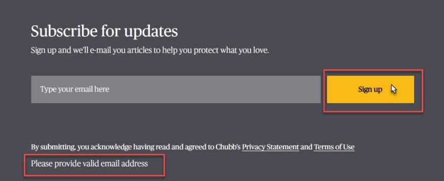 |
|
| 19. | Title and Link Component | Title and link component is used to author Plain text with CTA button. Keywords: Background type, Background type –Title and Link Section-> Header, Header font Color, Link font Color, Include border for header, Include border for link, Background type – Title and Link-> Title, Description, Text Alignment, Button Label, Link, I & F contact variation, Add Divider, Background Color, Title font color, Link to be opened in, Button type, Button background color, Icon, Font Color, Data CTA Value |
I&F Template - Title and Link Component | Title and Link Component - Classic Variation | reference live url |  |
Text, image and video
| S.No. | Component Name | Description | I&F Variations | Classic Variations | live Reference url | Component image |
| 1. | Brochure List | Brochure list component is used to dispaly a list of actions such as images with description and having share and download options. Keywords : Title , Pre text, Description, Footer text |
I&F Template Variation | non I&F Variation | reference live url |  |
| 2. | Featured Article | feature article should always include a headline, introduction, the main body and a concluding paragraph. Keywords : Title, Link, Is Client Story, (Dropdown: Automatic/Static), Article 1 & Article 2 |
I&F Template Variation | non I&F Variation | reference live url |  |
| 3. | Hero Carousel | It allows to create hero with carousel feature.which includes images and videos as well. Keywords : Carousel Variation, Background Type,Title, Link,Carousel Variation |
I&F Template Variation | non I&F Variation | reference live url |  |
| 4. | Hero Component | used to display page titles with background type as color/image/video with brief description about that page. Keywords : Background Color, Font Color,Back Link Label, Back link url, Title Description,Include Quick Links |
I&F Template Variation | non I&F Variation | reference live url |  |
| 5. | Perspective topic list | allows to create a list having filer option. Keywords : All Topics Text, Border color, Add button |
I&F Template Variation | non I&F Variation | reference live url |  |
| 6. | PRS Filtered Search(Agent Markenting Center) | allows to add the filter having asset type as search term with multi select searc options.Also search saved items. Keywords : Tiles json Path, Filter json Path |
I&F Template Variation | non I&F Variation | reference live url |  |
| 7. | Quote Image/Video/Text | To create quotes with images/videos/plain text description with background color. Keywords : Background type (Product / I and F), Background type (Image/Video) |
I&F Template Variation | non I&F Variation | reference live url |  |
| 8. | Story Module | Allows to create image with description/video with description having profile images. Keywords : Image, Image position, Author Name, Author Address , Background color , Button Title , Link , Link to be opened in , Data CTA Value , Description , Include Video , Play button background color , Play button color , Video type , Video ID |
I&F Template Variation | non I&F Variation | reference live url |  |
| 9. | Media and Text | this component allows to create a combination of text , video/image with button(share , download) options.handels all types of images with different sizes. Keywords : Layout type, Include CTA , Share button label, Button type, Border color, Font color, Link, Sharing Options |
I&F Template Variation | non I&F Variation | reference live url |  |
Text and Image
| S.No. | Component Name | Description | I&F Variations | Classic Variations | live Reference url | Component image |
| 1. |
Ad Component | used to display text having contact info and relative image. Keywords : Title, Header Title, Header Content, Body Title, Body Content, Footer Title, Footer Content |
I&F Template Variation | non i&f template Variation | reference url |  |
| 2. |
Additional Resources | used to display text with images in expand and collapsed. Keywords : Background image, Alt text, Description, Background color text, Font color, Collapse text, Expand text |
I&F Template Variation | non i&f template Variation | reference url |  |
| 3. |
Aeroscape - Caurosel | used to display the items in a carousal way. Keywords : Title, select border left separator color, Select top and bottom separator color, List |
I&F Template Variation | non i&f template Variation | reference url |  |
| 4. |
Agency Detail | used to display the details like contact info and email. Keywords :Title , Contact Number |
I&F Template Variation | non i&f template Variation | reference url |  |
| 5. |
Alert App Component | used to display the applications which are available in play store and app store Keywords : Title, Image Alt text |
I&F Template Variation | non i&f template Variation | reference url |  |
| 6. |
Bio Detail Component | It will help us to add the large image with title and description. Keywords : Image, Description |
I&F Template Variation | non i&f template Variation | reference url |  |
| 7. |
Client Story Content | used to display the client stories with images and detailed description ith contact info. Keywords : Article Heading, Description, Image, Image alt text |
I&F Template Variation | non i&f template Variation | reference url |  |
| 8. |
CTA Module | used to display the cta with background image and text on it. Keywords : Title, Description, Font Background Color, Font Color |
I&F Template Variation | non i&f template Variation | reference url |  |
| 9. |
Data Dashboard | used to display the dashboard images with description of it. Keywords : Image, Items – Icon Image, Resource Heading |
I&F Template Variation | non i&f template Variation | reference url |  |
| 10. |
Dynamic Related Product | used to display icons with background color and having some title with descriptions and link. Keywords : Layout type Section title, Include divider, Section |
I&F Template Variation | non i&f template Variation | reference url |  |
| 11. |
FAQ | used to display the text . | I&F Template Variation | non i&f template Variation | reference url |  |
| 12. |
Flip Component | used to display the text with customized way having background color. Keywords :Button Type, Button Background Color, Flip title color, Link text & Add Flips |
I&F Template Variation | non i&f template Variation | reference url |  |
| 13. |
Icon Holder | it will helps us to create a page having icons with border line and link to the text. Keywords : Icon, Icon color, Title, Link |
I&F Template Variation | non i&f template Variation | reference url |  |
| 14. |
Icon Promo Component | used to display icons with description with download and share button options. Keywords : Title, Description, Include CTA, Include Icon, Include Info Card |
I&F Template Variation | non i&f template Variation | reference url |  |
| 15. |
Icon with description | It will helps us to create a components having icons with description for those icons. Keywords : Header, Description, Border line color on the top of the card, Select Font Color |
I&F Template Variation | non i&f template Variation | reference url |  |
| 16. |
Parallax | Use the Parallax component to create the illusion of depth with layers of images. As the viewer scrolls the page up or down on a mobile device, the foreground and background images move at different speeds. Keywords : Overlay Image, Pre-Title, Description, Top borderline color, Background color, Font color |
I&F Template Variation | non i&f template Variation | reference url |  |
| 17. |
Product Category | Product Category component is used to display the various products information with icons and some description. Keywords : Select Icon, Icon Title, Path to be redirected, Link to be opened in Same or New Window?, Description |
I&F Template Variation | non i&f template Variation | reference url |  |
| 18. |
Quote with related Product | Quote with related product is used to display the customer image with review and realted product information. |
I&F Template Variation | non i&f template Variation | reference url |  |
| 19. |
Related Content | Related Content Component is used to author the documents links with related icons, pre-text, title and description. Keywords : Layout type, Section |
I&F Template Variation | non i&f template Variation | reference url |  |
| 20. |
Webinar | Webinar Component is used to configure the different webinar registrations based on requirement. Keywords : Header, Sub Header, Description, Presented By Label, Header, CTA Title |
I&F Template Variation | non i&f template Variation | ||
| 21. |
Agent Detail | Agent Detail Component is used to display the Information about an agent with their image and contact number. Keywords: Image Icon, Ribbon Text, Ribbon Background Color, Agent Image, Image is decorative, Title, Description, Phone Number, Background Color |
I&F Template Variation | non i&f template Variation | reference url |  |
Navigation Components
| S.No. | Component Name | Description | I&F Variations | Classic Variations | live Reference url | Component image |
| 1. | Left Navigation Component | Left Navigation Component is used to navigate within the webpage using the section headings present in the page. Fields in the component are: Enable Left Navigation |
I&F Template - Left Navigation Component | Left Navigation Component - Classic Variation | reference live url | 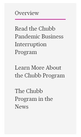 |
| 2. | Tabs Component | Tabs component is used to seperate the data using tabs functionality and provide different content in the each tab. Fields in the component are: Tabs details, Tab width, Set active tab, Tab layout, Active tab bottom borderline color |
I&F Template - Tabs Component | Tabs Component - Classic Variation | reference live url |  |
Layout components
| S.No. | Component Name | Description | I&F Variations | Classic Variations | live Reference url | Component image |
| 1. | Body Copy Container | Body Copy Container is used as Layout container in which we can add different components and align them as per the requirement. Fields in the component are: Body Copy Position, Container Background Color |
I&F Template - Body Copy Container | Body Copy Container - Classic Variation | reference live url |  |
| 2. | Custom Container | Custom Container is used to accomodate various components with different variations. Fields in the component are: Container is, Inner container, ID, Container Background Color, Class Name |
I&F Template - Custom Container | Custom Container - Classic Variation | reference live url | 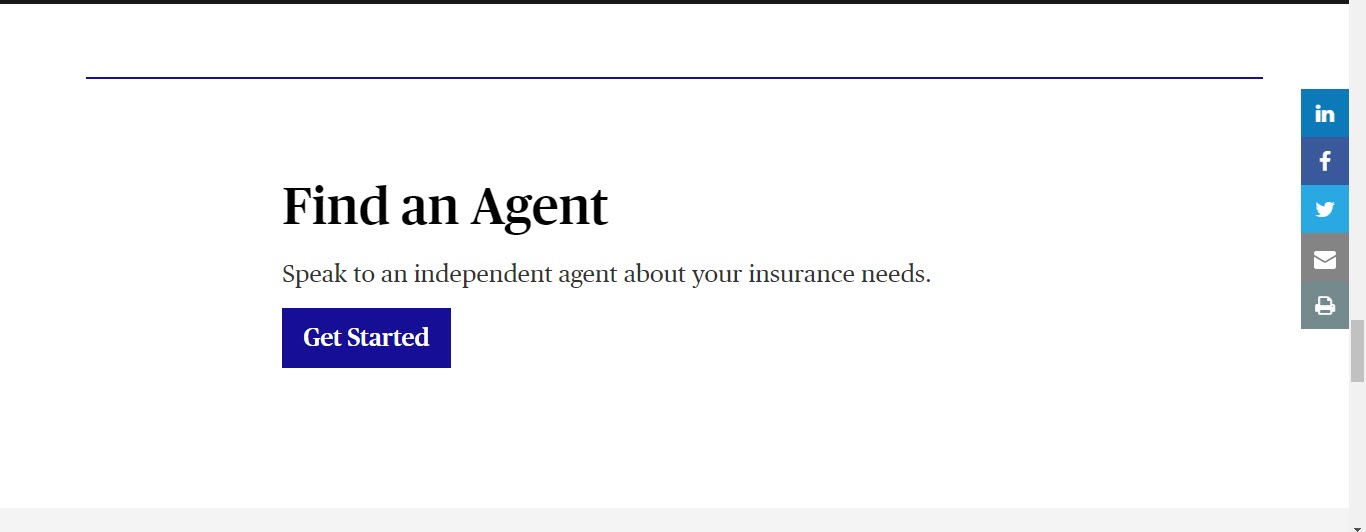 |
| 3. | Multicolumn Container | Multi Column Container is used to select the number of columns in which we can use various components as per requirement. Fields in the component are: Number of columns |
I&F Template - Multicolumn Container | Multicolumn Container - Classic Variation | reference live url | 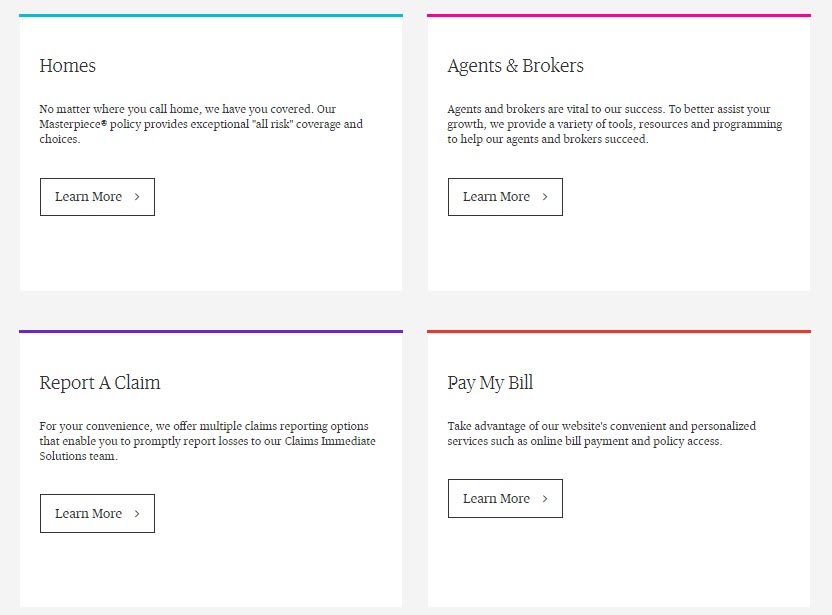 |
| 4. | Bodycopy with Background Image Container | Bodycopy with Background Image Container is used to if we need any image as the background for our layout container. Fields in the component are: Background Image, Text background Color |
I&F Template - Bodycopy with Background Image Container | Bodycopy with Background Image Container - Classic Variation | reference live url | 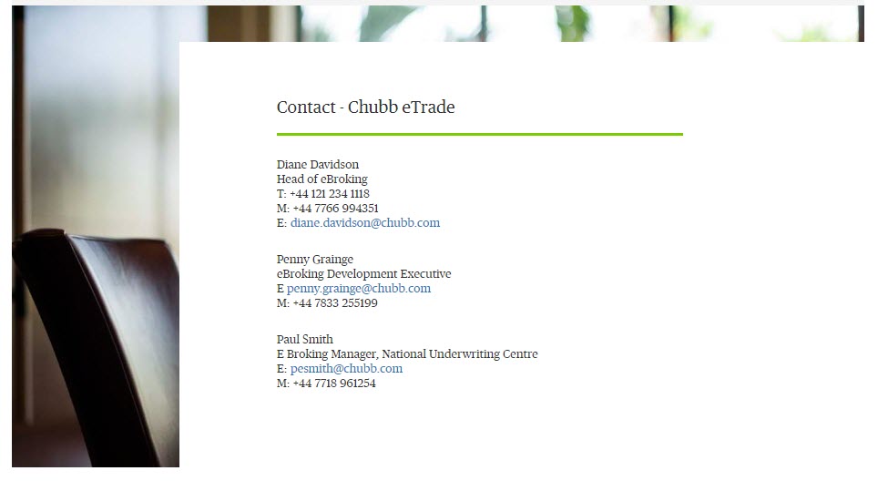 |
Articles Section
| S.No. | Component Name | Description | I&F Variations | Classic Variations | live Reference url | Component image |
| 1. | Article Filtered Search | This component will allows us to add articles with search filters.The results of the articles will display on the page based on the filters applied. Keywords : Landing Page Type, Path of Tags and Regions, Text(Show me), Placeholder(All topics), Text(Select topics), Text(in), Placeholder(All regions), Text(Select regions), CTA title(Clear filter), CTA title(Load more), SearchLabels |
I&F Template Variation | non I&F Variation | reference live url | 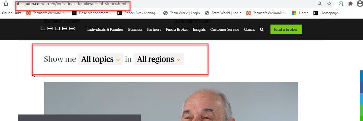 |
| 2. | News Feed | this component is used to add the news from external api in to our webpage . We can restrict the number of list displayed in the api as well. Keywords : Section Title, News Type, API Feed URL, Background Color, Border Color |
I&F Template Variation | non I&F Variation | reference live url |  |
| 3. | Related Resource articles | Displayes the entire list of articles in single page. Keywords :Article ID, Read more Button Text |
I&F Template Variation | non I&F Variation | reference live url |  |
| 4. | Relate Article filters | used to add the filters for related articles. Keywords :Form Options |
I&F Template Variation | non I&F Variation | reference live url |  |
Form Component
| S.No. | Component Name | Description | I&F Variations | Classic Variations | live Reference url | Component image |
| 1. | Form Component | used to add forms with different form components submit and recaptcha in our page. Keywords : Type, Title, Name, Value,Form Text, Form Button ,Form Options (Checkbox, radio, dropdown, multi select menu) ,Recaptcha,Form text with border Note : |
I&F Template Variation | non I&F Variation | reference live url |  |
| 2. | Form Text With Border | allows to add text with heading and colored horizontal line. Keywords : Type, Title, Name, Value ,Form text with border |
I&F Template Variation | non I&F Variation | reference live url |  |